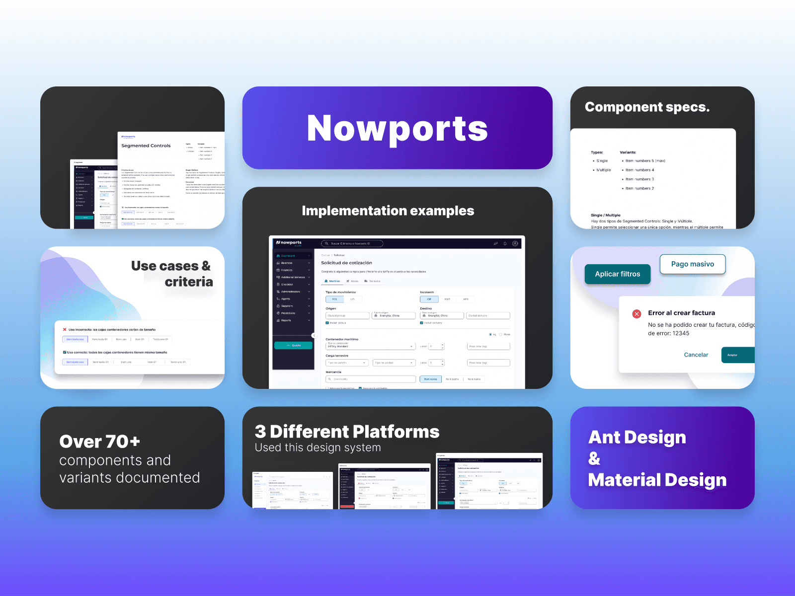
Nowports - Admin platform (Finances)
Stori is a emerging banking service in México that offers people with no previous financial experience a chance to create and ammend their credit scores.
I had the opportunity to work with Stori in a design challenge where I had the task of improving the usability, ui and ux of the payments screen of their app.
Use case
Positive conversion rates
Time constraint
5 Days
Role
UI/UX Designer
Tags
UI/UX Design, Challenge, Research
Defining the vision
Main problem
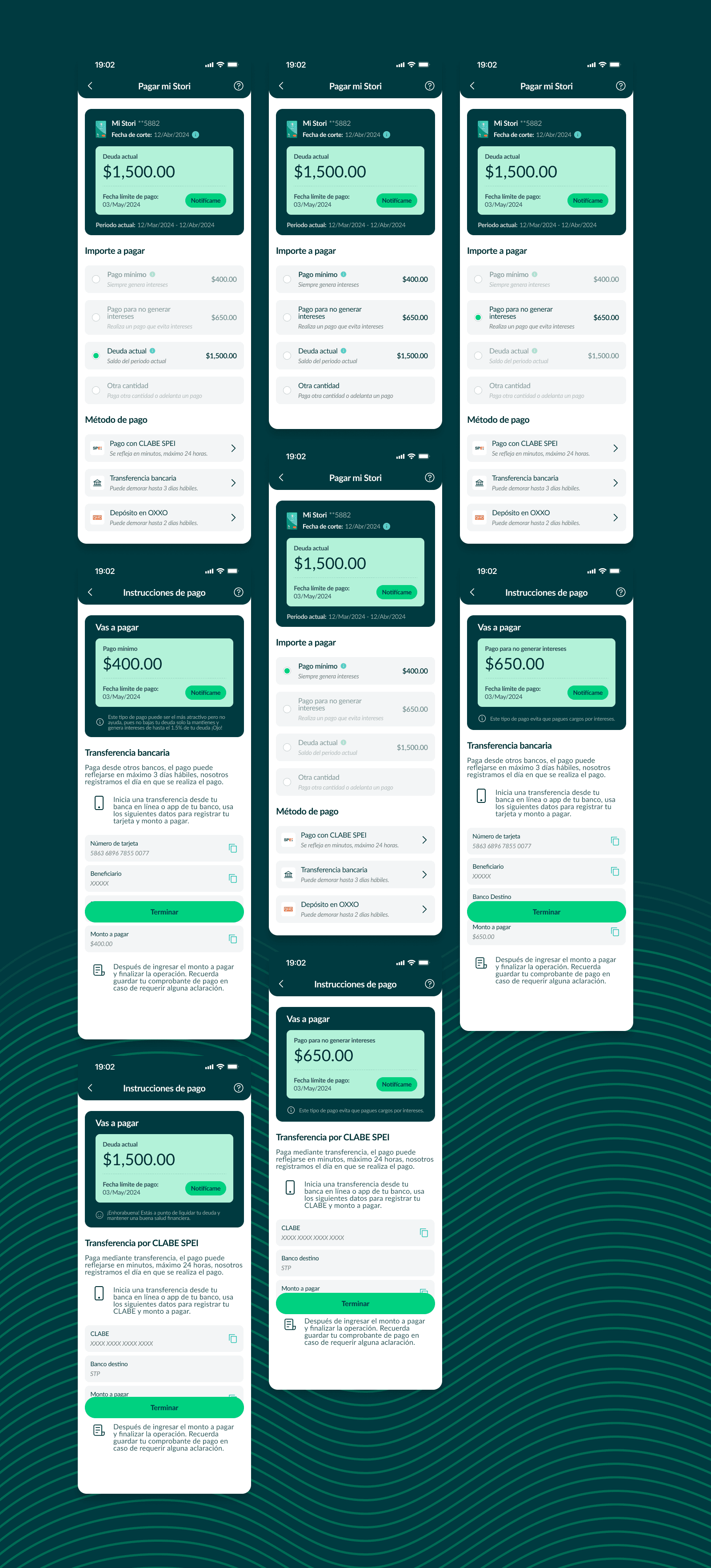
I started this project by reading the requirements and provided research, focusing on the issues related to the "Pagar mi Stori" screen.
The evident issue was that users, being mostly first-time credit card holders, are unfamiliar with financial terminology and how the system works.
Potential impact
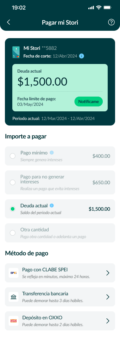
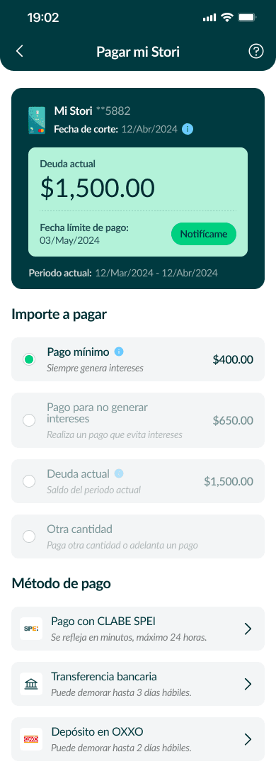
Good usability in a banking app can significantly enhance the experience when making payments. With intuitive design and clear navigation, a well-designed app ensures that the payment process is straightforward and efficient.
Once in the payment section, a user-friendly interface displays relevant information, such as payment recipients, amounts, and due dates, in a structured manner.
Proposed added value
What
Improve "Pagar Mi Stori" usability and overall UX, generate better conversion rates.
Who
Users who want to pay their Stori card and struggle to do it on the app.
When & Where
Mobile app
User research & insights

Research
Although I had research provided to me, I decided to investigate the competition. In this case, I researched institutions such as BBVA, NU, Banamex, GBM, and Santander to observe their processes, analyze how they carry them out, and identify what they do well. This allowed me to compare and gather elements that could be used to enhance the user experience.
Insights
What the competitors did on their flows was that they showed a clear interface and a seamless experience through their payment sections which benefits their users needs.
Some had simplified information on the screen while others had too many information on it, I had to create a middle ground where I could integrate the business needs and the best possible user experience.
The design
The research and insights helped enormously when putting together this design and there are some important features that I wanted to highlight in this design:
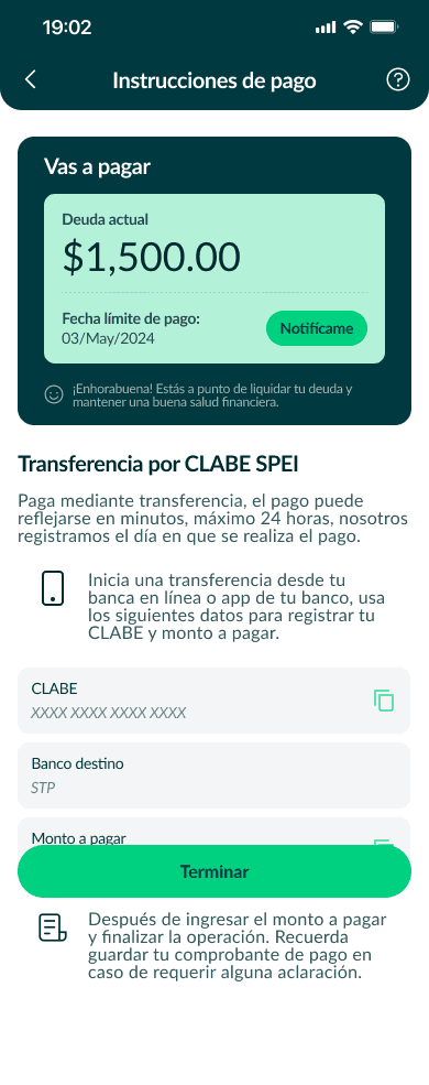
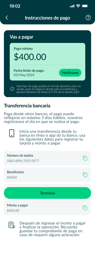
Clear and simple design
Ability to see clearly what is your current debt
Ability to see when is the due date to make a payment
All-in-one screen to make a payment, this ensures users doesn't lose track of the process.
Clear indications and tooltips to help users better understand each piece of information presented to them.
The takeaway
Be mindful of the users
Users' thoughts and abilities are the most valuable information you can have when designing a new product, you have to be mindful of what they want and what they need in order to offer them something in return.
Do usability tests
Run surveys or interviews
Map every piece of information about your users and build maps and personas.
Test and improve
It is very important to do a follow up on your designs so you can get some feedback from users and improve the designs.
Do usability tests
Run surveys or interviews
Test heatmaps
Always be mindfull of the stakeholder at all times